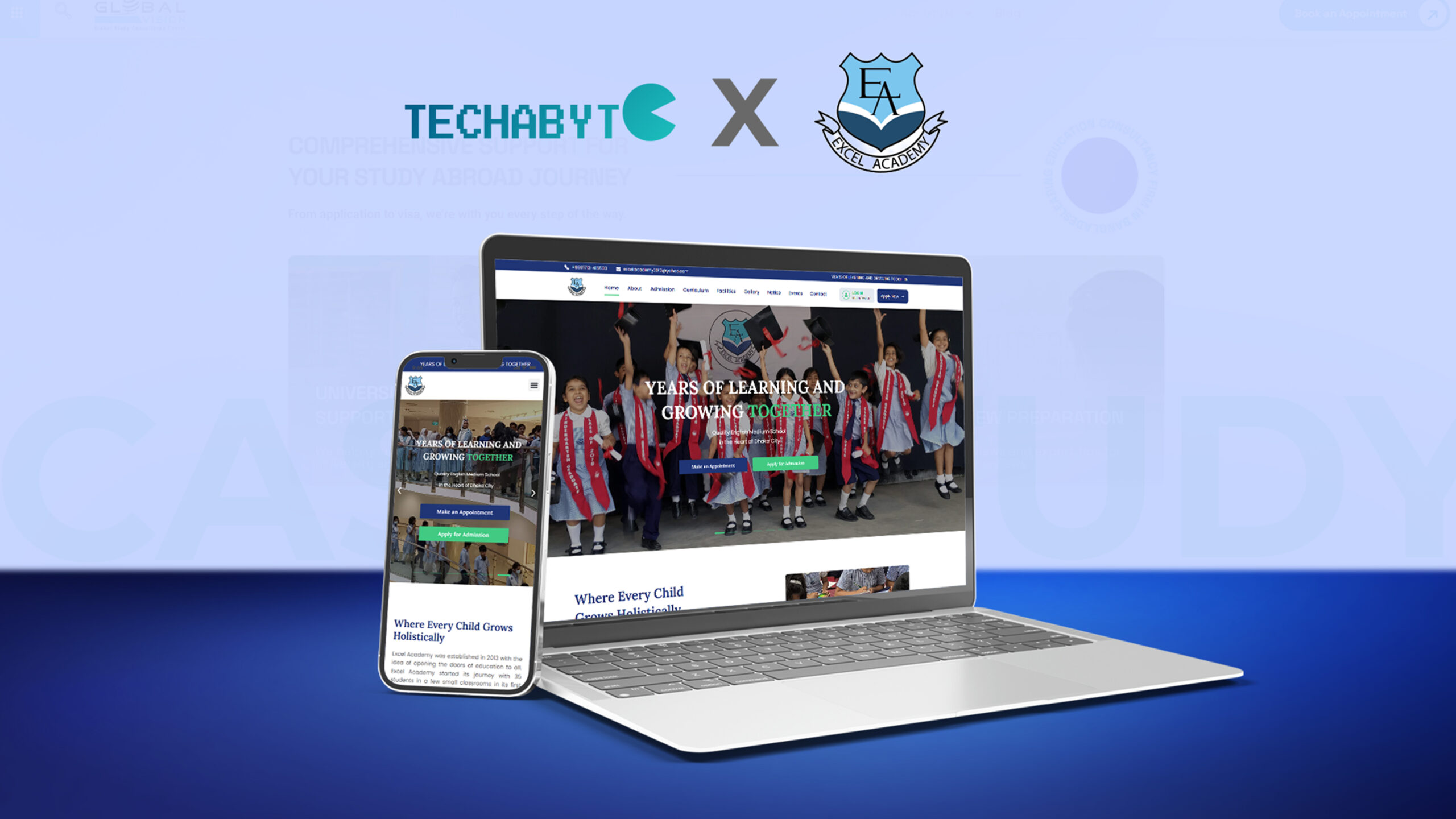
Client Overview
| School Name | Excel Academy |
| Type | English Medium School (Co-education) |
| Classes Offered | Playgroup to O Level (Cambridge curriculum) |
| Established | 2013 |
| Location | House 11, Road 7, Dhanmondi, Dhaka |
| Website | excelacademy.edu.bd |
Excel Academy is a leading English medium school in Dhanmondi, one of the most prestigious residential and academic areas in Dhaka. The school has been providing a Cambridge-based curriculum from Playgroup to O Level since 2013, while prioritising the needs of young students in a structured and supportive environment.
Like most private schools of its kind in Dhaka, Excel Academy has built up a good reputation in recent years largely through word-of-mouth among parents in Dhanmondi and the surrounding neighbourhoods. But the school did not have a contemporary website that could showcase their school professionally and provide valuable information to prospective parents and students.
The Brief
The development team was approached by Excel Academy with a significant request: a school website that parents, especially first-time visitors, would find credible, easy to use and informative.
The key requirements outlined in the brief were:
– A clean, institutional design that reflects the school’s academic standards and English medium identity
– Clear presentation of academic programs — from Playgroup through O Level
– A dedicated section for school news, notices, and events
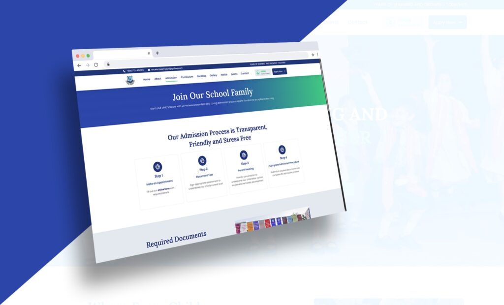
– Information pages for admissions, including how to apply
– A gallery or visual section showcasing school life and activities
– Contact information and a contact/inquiry form
– A section highlighting the school’s faculty and academic approach
– Mobile responsiveness — many Dhaka parents browse on smartphones
– Clean, fast-loading pages suitable for typical Bangladeshi internet speeds
– An easy-to-update structure so school staff could manage content after handover
The client had no prior website. The project was a complete ground-up build, beginning from a blank canvas.
Challenges
Audience: Parents, Not Students
While the target audience for a university or coaching college website is a young adult, the target audience for a school website is parents – often in their 30s and 40s – who are making a major decision for their child’s future. The visuals, copy, and hierarchy of information had to take this into account. Transparency, credibility and trust were favoured over the latest special effects.
Content Gathering from a Non-Digital Client
Schools don’t always have digital content. Gathering text, faculty details, course details and appropriate photos from a school administration that is busy with teaching and learning meant communication and time. A content checklist was used to organize this.
Designing for Institutional Credibility
An English medium school website must be mature and professional, not a fledgling or commercial website. Another key design consideration was to strike a balance between child-friendly and professional, academic. Type, space and colour were all taken into account with this need in mind.
Post-Handover Editability
School management teams post notices, results, exam dates, and event announcements. The site needed to be developed in a way that a non-technical school staff member could update these areas without requiring the developer for each change. This meant leveraging the built-in WordPress post and page structures, and the editable elements of Elementor.
Design Process — Figma First
A key difference between this project and a typical direct-to-builder approach was the use of Figma for the user interface design process prior to development. The Figma-first approach offered a number of advantages to this project.
Why Figma Before WordPress
A school website is aimed at a targeted audience. Decisions about the look and feel of the site were made before we started building (rather than in the page builder) so that choices about colour, spacing, typography and hierarchy were made with intention, and presented to the client in a sharable, commentable format. Figma frames can be edited quicker than live Elementor sections, meaning feedback was quick and efficient.
What Was Designed in Figma
– Homepage layout: Hero section, programs overview, why choose us, news/events strip, gallery, contact CTA
– Inner page templates: Academic programs page, admissions page, about/faculty page, contact page
– Navigation structure and mobile menu layout
– Color palette definition: institutional green, white, and warm accent tones
– Typography scale: heading sizes, body text, button labels
– Card components for news posts, program listings, and faculty profiles
Client Review in Figma
The Figma prototype was reviewed with the client prior to building. This one-time review – of all key pages – enabled the client to provide feedback on overall visual design, which was then incorporated before WordPress development began. This avoided expensive design changes during the build, which would have been much harder to do within Elementor.
Technology Stack
| Figma UI Design & Prototype | WordPress CMS Platform | Elementor Page Builder | Custom CSS Styling Overrides |
WordPress was chosen as the content management system (CMS) for the same reasons it’s a good choice for institutional sites in general: it’s robust, supported and easy for non-technical users to manage once the project is handed over. All page layouts were developed using Elementor, converting the Figma designs into responsive pages. Custom CSS was used to address specific styling issues – primarily navigation, card hover effects and micro-adjustments to spacing – that Elementor’s controls couldn’t address.
The conversion from Figma to Elementor was seamless because the design was already locked in: colours, fonts, spacing and component structures were defined in the Figma file and imported into Elementor’s Global Style and widget settings.
Development Process
Discovery & Figma Design (Day 1–4)
– Briefing session with client to understand school structure, audience, and requirements
– Site architecture mapping: pages, navigation, content categories
– Full UI design in Figma: homepage + inner page templates
– Client review of Figma prototype and feedback collection
– Design revisions and final Figma sign-off
WordPress Setup & Global Styles (Day 5–7)
– WordPress installation and configuration on hosting environment
– Elementor Pro setup and global font/color system matching the Figma design
– Header and footer built as global templates
– Reusable section and card components established
Page Build — Homepage & Core Pages (Day 8–12)
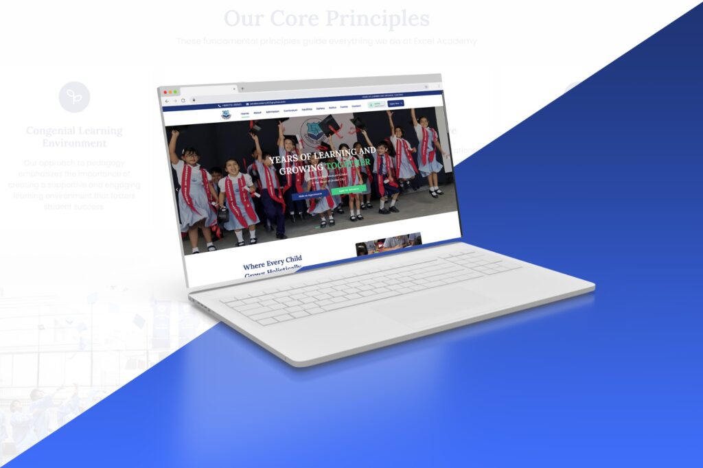
– Homepage: Hero, Academic Programs overview, Why Excel Academy, News & Events strip, Gallery section, Contact CTA
– About Us page: school history, mission, vision, leadership
– Admissions page: how to apply, class availability, inquiry form
– Academic Programs page: Playgroup through O Level program descriptions
– Faculty/Team page with profile card layout
– Contact page with embedded Google Map and inquiry form
News, Gallery & Dynamic Content (Day 12–15)
– Blog/News section configured using WordPress Posts for school notices and updates
– Gallery page with image grid layout
– Events section for upcoming school activities and exam schedules
– All content sections made easily editable by school staff post-handover
Review, Optimization & Launch (Day 16–18)
– Full cross-device testing: mobile, tablet, desktop
– Image optimization for faster page loading
– SEO basics: page titles, meta descriptions, heading structure, alt tags
– Client walkthrough and final content corrections
– Site go-live and post-launch verification
Pages & Sections Delivered
| Page / Section | Details |
| Homepage | Hero, programs overview, highlights, news strip, gallery, contact CTA |
| About Us | School history, mission & vision, leadership message |
| Academic Programs | Playgroup, Nursery, KG, Classes 1–10 (O Level preparation) |
| Admissions | Process overview, class availability, inquiry form |
| Faculty | Teaching staff profile cards |
| News & Notices | WordPress blog-based, editable by school staff |
| Gallery | Photo grid of school activities and events |
| Events | Upcoming activities, exam schedules |
| Contact | Address, phone, email, Google Map, inquiry form |
Key Features Delivered
– Figma-designed, Elementor-built fully responsive website across all devices
– Clean institutional design — professional, warm, and credible for a parent audience
– Academic programs section clearly structured from Playgroup through O Level
– Admissions inquiry form with subject and class selection
– WordPress-based News & Notices section — fully editable by school staff without developer help
– Photo gallery showcasing school life, activities, and events
– Faculty profile section with card layout
– Google Maps integration on the Contact page
– Mobile-optimized layout throughout
– SEO-ready structure: correct heading hierarchy, meta titles, image alt attributes
– Staff-editable events and notice board sections
– Global header with full navigation and footer with contact details
The Value of the Figma-First Approach
In the case of a school website – where the client is likely not a technology-focused organisation and design choices are difficult to understand verbally – having a design mockup to show before development starts is a practical advantage.
| Without Figma | With Figma (This Project) |
| Design feedback happens in the live builder – changes are slow | Design feedback happens in Figma – changes are quick and inexpensive |
| Client gets to see the site for the first time mid-way through the project – expect surprises | Design is signed off before development starts |
| Several rounds of revisions after launch | One round of feedback before development |
| Inconsistent use of fonts and colours across pages | Global design system in Figma and Elementor Global Styles |
Outcome
The Excel Academy website was delivered and launched in the expected 2-3 weeks. The school now has a professional and trustworthy presence that reflects their educational program and ethos to prospective parents and students looking for English medium schools in Dhanmondi.
| 9+ Pages Delivered | 5 Dev Phases | Figma Design-First Workflow |
“We wanted parents to visit our website and be reassured that Excel Academy is a professional and well-managed school. The new design does just that – it’s not too corporate, and all the information a parent needs is readily accessible.”
— Excel Academy, Client Feedback
Smart Admission Enquiry: Connecting the Right Parent to the Right Information
Prior to the website’s development, the only way for parents to ask questions about admitting their child to Excel Academy was to either call or visit the school and ask some basic questions – which classes were available, how does the admission process work, are there seats available in the class I am interested in? This placed an undue burden on the school’s staff, who were busy with other school-related work.
The enquiry form for admissions on the new website was designed to overcome this. The enquiry system was built to understand the parent’s situation from the point of first contact, as opposed to simply collecting name and phone number. When parents fill out the form, they are first asked to choose which class they are enquiring for – Playgroup, Nursery, KG or a particular grade (Class 1 to 10). This choice determines what other information is relevant to them: which session they are looking for, the name of the current school (if any), and any specific questions they may have. The end result is that each enquiry the school receives is already categorised by class, and can be immediately acted upon.
Previously, there was only a contact form that resulted in submissions with no context – only a name and phone number. The school would need to call back to find out what the parent wanted. Now, the initial call is educated. They know what class the parent is inquiring about, what time the parent is referring to, and what they are asking about. The discussion is able to begin at a more effective starting point, which is a win-win for both parties. Parents also get a better deal – rather than answering questions that don’t apply to them, they fill out a shorter form that is relevant to them. This increases the likelihood of a parent completing the enquiry.
The admission enquiry form transforms a phone call into an enquiry form – saving the school time, and giving parents a quicker and clearer first impression.
Intuitive Navigation: Built Around the Parent’s Questions
A school website is a decision-making tool. New visitors are looking for the answers to a handful of questions: What ages do you serve? What curriculum do you follow? How do we apply? What does the school look like? How do we get in touch? If a school’s website doesn’t answer these questions, the parent will move on.
Excel Academy’s menu is based on this principle. Instead of grouping the menu items according to the school’s administrative structure, they were grouped according to the questions a prospective parent would ask, and in the order they would ask them. About Us answers whether the school is reputable. Academic Programs answers whether the school is right for the age. Admissions answers how to get started. Faculty answers who will be teaching the child. Gallery answers what the school is like. Contact answers how to reach someone.
All of the navigation items are only one click away from the home page. No submenus or category trees. A parent looking at the site on a mobile phone (most first-time visitors in Dhaka access the site this way) can get to any section in two clicks. The mobile menu was designed and tested to be easy to use with a thumb, not a squished down version of the desktop menu.
Organized Information: Presenting the School Clearly and Completely
A school is a multifaceted organisation: it has various year levels, a curriculum, a faculty, an enrolment process, a physical address, events and a history. How to present this in a way that is not overwhelming but clear, involves careful consideration of what information goes into each section, how much detail is provided and in what order it is presented.
The homepage was intended to be a stand-alone overview of Excel Academy. A parent who only visits the homepage should know what it offers, who it’s for, why it’s safe and reliable, and what to do next. This was done by carefully ordering the sections on the page – starting with the school name and tagline, followed by the programs overview, then the school’s strengths, followed by a quick look at the faculty, recent news and events, a photo gallery preview, and finally a call to action to contact the school. Each section addresses a question and leads the parent to the next.
Each inner page has a single focus and a single call to action. The Academic Programs page offers a clear overview of each year group without extraneous information. The Admissions page gives an overview of the process and what to do next. The Faculty page features profile cards to humanise the teaching team. There’s no attempt to overcrowd these pages – they provide the parent with the information they need at that point of their journey, and then direct them to the next step.
The same visual elements are used throughout the pages – the same card, the same section headings, the same buttons, the same spaces. When a parent navigates from the homepage to the Admissions page to the Contact page, they are always on the same, well laid out website. This was done in the design process in Figma, and then carried through to the build in Elementor using global style and section templates. It may seem like a small thing – but it is the sort of thing that parents don’t notice, but which communicates that Excel Academy is a school that cares.
Reflection
This project demonstrated a common principle of working on institutional websites: design is not a cost, it is an investment that saves time in revisions, client expectations and build time. The ability to work out the visual design in Figma before starting the build in Elementor allowed the build to be efficient and targeted, rather than design-by-discovery within the page builder.
School websites are different to business or agency websites. The information architecture needs to be parent-focused – structured around ‘What do you teach?’, ‘How do we enrol?’, ‘What is the school like?’ – rather than around the school’s priorities of what to feature first. Organizing the site around the parent’s decision process, rather than the school’s structure, was a conscious choice that influenced the entire hierarchy of the site.
WordPress and Elementor are a suitable and sensible choice of technology for this kind of institutional client: the back-end content management system is user-friendly enough for the school office to manage notices, news and events by themselves – which is a key requirement of any school website once it launches.
Interested in a similar project?
We design and develop professional websites for schools, institutions, and service businesses.